Have you ever looked at a chart and thought “this looks like something I’d see on social media, so, it’s not a serious study”?
I always take it in with a grain of salt.
A recent study from MIT shows that data visualisations, which means charts, graphs, those fancy infographics communicate more than the numbers they display.
They also signal something about who created them, why, and for whom. This “social meaning” influences how we respond to the visualisation, even when we don’t consciously notice it.
What is the socio-indexical function of visualisation?
Let’s first start with propositional vs non-propositional meaning. In traditional thinking, a chart is supposed to perform a propositional function, that is, it communicates a fact, e.g. “COVID cases rose by 30% in February”. But the MIT study argues there’s more going on.
Visualisations also carry socio-indexical meaning, which means, cues about the social context of the visualisation, as in, who made it, what their purpose might be, and how viewers should feel about it.
From language to visualisation
To borrow from linguistics, when someone speaks in a certain accent or uses slang, we make inferences about them, that is, age, region, social group, even before hearing their message. Visualisations work in a similar way. Design features like colour palette, chart type, typography or the “look”” of the visualisation act like “accents” in visual form. They signal social provenance.
How people draw “vibes” from visualisations
The study found that viewers make social attributions, sort of like, inferences about the people or organisations behind a visualisation. These might include:
- The maker’s competency (“This chart must be by a professional designer”)
- Political or ideological stance (“Looks like something done by a partisan website”)
- Motivation (“Are they informing or persuading?”)
- Tool used (“This looks like Excel, or something homemade”)
Interestingly, many of these attributions happened just from design alone. Even when the text, labels or axes were removed, viewers still made judgments.
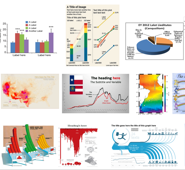
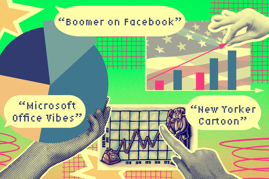
Examples of “vibes”
- A chart with aggressive, saturated red and black colours and state-flags might evoke a “political campaign” feel. One participant said, “This kind of looks like something a Texas Republican legislator would put on Twitter”.
- A very minimal, plain bar-chart in grey or light blue might evoke “Microsoft Office / academic” vibes, thus, signalling neutrality, seriousness.
- On the flip side, when something looks too polished or “slick”, some viewers assume it’s more advertisement-than-research and become more sceptical.
Sociocultural context matters
These inferences don’t happen on their own. They’re shaped by the viewer’s background, their culture, their design literacy, their experiences of where they have seen visualisations before. For example, the initial phase of the study involved users of Tumblr, who brought particular aesthetics and associations to the task.
Who are the actors behind a chart?
The study explains different types of people, or tools that viewers can guess from how a visualization is designed. These include:
- Maker: the general entity producing the visualisation
- Principal: who commissioned it
- Author: who physically created it
- Animator: who published, shared or distributed it
- Tool: e.g., Excel, R, Tableau
- Mode: publication channel (social media, newspaper, academic journal)
Viewers may attribute identities (age & gender) and characterisations (competence & intent) to these actors. These attributions matter because they affect how the visualisation is received.
Trust and engagement: Why design choices matter
One major finding is, a chart that looks nice can make people trust it more, but this depends on whether they think the chart’s purpose and message match their own values. The researchers found:
- If viewers believe the visualisation is intended to inform, they trust it more than if they believe it’s intended to persuade.
- If viewers believe the maker shares their values, the chart is trusted more heavily.
- If the design is too polished, some viewers assume commercial or persuasive intent, and trust goes down.
Implications for dismissal or engagement
If the viewer’s first reaction to a chart is a judgement about who made it (rather than what it says), that shapes whether they engage with it, or walk away. Some participants admitted they’d “skip” a chart because they disliked its design feel or didn’t trust the implied source.
Research framework: A map of how it works
The authors developed a conceptual model which links:
- Design features of visualisations (colour, chart type, typography)
- Viewer’s sociocultural context (their experiences, values)
- Social attributions (inferences about makers, tools, mode)
- Reception & behaviour (trust, engagement, dismissal)
They also constructed a typology and ran quantitative studies to show these effects at scale.
What this means for designers & readers
For designers:
- Recognise that every visual-choice carries social meaning. A font, a palette, a chart type might send signals you didn’t intend.
- Think about your audience: what signals might they read into your visualisation?
- It’s not enough just to show data clearly. You must also consider how the design might affect trust, perceived intent, and value alignment.
For readers/interpreters:
- Be aware you’re making social inferences, even if you don’t realise it.
- Try to separate: what the chart says (data content) from what it tells you about the maker or context.
- Ask: “Do I trust this because of what the data shows, or because of how it looks and who I assume made it?”
Key Insights
- Data visualisations carry two kinds of meaning: the propositional (the data) and the socio-indexical (social signals about origin and intent).
- Design features alone (colour, type, layout) can trigger social inferences, even when textual content is hidden.
- These social inferences strongly influence trust and engagement with data visuals.
- The effect is universal across groups, not just among design-savvy users.
- Designers and communicators need to think beyond “clear data display” and consider “what does this look like, who does it appear to come from, and how will that affect reception?”
Takeaway
When you next create or view a chart, pause and ask:
What is this visual really telling me, about the data, yes, but also about the maker and the context?
In the world of data communication, trust isn’t just built by accuracy, it’s shaped by aesthetics and perceived intent. So, the next obvious question is, can we build visualisations that not only display facts, but also earn trust by signalling the right provenance and values?
FAQs
Q1: Why is this research important for data communication?
A: Because it shows that data visualizations aren’t just passive conveyors of information. They are social artifacts that shape how people interpret and engage with charts. Understanding this helps communicators design visuals that are not only accurate but also socially aware.
Q2: When might this insight be applied in real life?
A: These findings have practical relevance in journalism, public policy, corporate reporting, and academic communication, anywhere visualized data meets the public. Recognizing the socio-indexical function can help organizations avoid misunderstandings and build trust in data storytelling.
Q3: Does this mean design doesn’t matter for accuracy?
A: No. Accuracy and clarity remain the foundation of good information design. But as this research shows, the aesthetic and social cues of a chart influence how seriously people take the data. A perfectly accurate graph may still fail if the design’s “vibe” feels manipulative, biased, or too polished to trust.
Q4: How can designers make visualizations more trustworthy?
A: Transparency and intent matter as much as beauty. Designers should:
- Use clear labeling and neutral color palettes
- Avoid overly “slick” commercial styles that suggest persuasion
- Match the tone of the chart to the seriousness of the data
- Credit the tools and data sources used (e.g., R, Tableau, or government datasets)
These small design choices build perceived authenticity, which research from the MIT Visualization Group found to increase viewer trust and engagement.
Q5: What does this mean for data literacy and education?
A: It expands the definition of data literacy beyond reading numbers. True literacy includes recognizing visual cues, social signals, and contextual framing in charts. Teaching students and professionals to question “who made this, and why?” can prevent misinformation and strengthen critical thinking in the age of AI-generated visuals.
Reference: MIT News